Whisper and Shout: Use Contrast to Add Interest to Your WaterSpace Design

Things get livelier when you add contrast to your outdoor living design
Wherever you add an unexpected change in color, or shape, size, or texture, you’ve got contrast. In this article on the second principle of architectural and landscape design, we’ll look at how contrast helps us achieve that delicate dance between the comforts of a well-ordered space and the need for something that catches our interest.
In the first principle of design we explored how humans can’t tolerate a lack of balance (story here). But it turns out humans find too much balance is…just…plain…boring. We use the principle of contrast to mix things up—to keep it interesting.
Change Colors for Contrast

Of all the ways we can create contrast, color is the easiest to employ and the most readily noticed by a casual observer. Color contrast can be stark—like black and white or bright red against equally bright green—or subtle, as in shades of gray or white tints.
Color contrast is achieved through the choice of hue—think of all the colors in the rainbow with their infinite variations and combinations. Or you can change the value—a lighter tint or darker shade. The greater the difference in value, the greater contrast. (Learn more about designing with color here)
Change Shape and Size for Contrast
Shape and its partner size play a large role in outdoor living spaces, and they do it in three dimensions. When you think about shape and size, you also have to take scale and proportion into account. Scale concerns how large or small things appear in a landscape. How does a landscape feature or a built element appear in relation to other features and elements? Proportion concerns how these shapes relate to one another. Proportion can be pleasing, or interesting, but it goes wrong in a hurry when size and shape go too far out of balance. (Learn more about shape here)
Add Texture for Contrast
In many ways, texture is the essence of contrast. Unless you’re a designer, you probably think of texture as how a rough or smooth surface feels. If it’s called “textured” it’s definitely not smooth. In design, texture adds visual interest. But it has to do so in harmony with the overall design. In “The Tao of Texture” we explore the benefits of adding texture and harmony to your WaterSpace—really any living space you occupy. You can get the whole story here.
Look to Water and Nature for Contrast in Motion
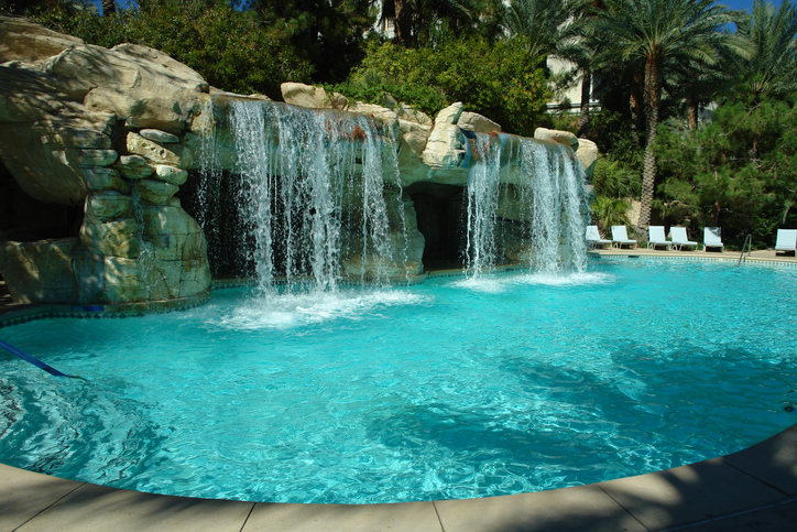
Motion and contrast. It’s how water and nature keep capturing our interest. They look familiar, comforting, and yet every new moment offers the possibility of new contrasts, new delight, and surprise. Sometimes new contrasts arrive in slow motion, as when plants and trees grow, or bloom, or change colors with the seasons. Other contrasts arrive like clockwork with the movement of the sun, or more suddenly with the passage of clouds. Water features, such as falls and fountains, bring continuous changes in colors and sounds. And then there’s reflection, water’s mysterious change artist. You can read more here, in “Discover the Hidden Power of Reflection.”
Add an Accent or an Exclamation!
Low and high contrast are the accent marks and exclamation points of design. Designers often talk of accent pieces that add contrast ranging from subtle to bold. Even bold accents don’t have to overwhelm the space. Think of the difference between an accent mark—emphasis on a particular part of a word—and an exclamation point that turns a whole word or sentence into a shout.
Accents in landscape architecture offer softer contrast—the smaller, more subtle design element that adds interest without shouting or calling too much attention to itself. It’s a milder voice, making a quiet but firm statement in favor of a little more contrast.
High contrast, like the exclamation point, carries more weight than the accent. The higher the contrast, the louder the voice speaking out against conformity. Just be careful. Bold contrast needs to be handled with care and skill. Get contrast wrong, and one contrasting element cancels out another—just like those noise canceling headphones. Get contrast really wrong, and the whole design concept gets overwhelmed in noise.
For more about accent and contrast, go here for a brief discussion on britanica.com. While there, I’d recommend reading the entire article, “Garden and landscape design” for a good overview of design and landscape architecture.
Coming up next
In the next edition we’ll be looking at emphasis. You can find a summary of all six principles of design here.