Color Choices In Pool Design – How to Talk About Color
I make lots of color choices and design decisions at work, but my wife picks the colors in our home. Some people think professional designers dictate color choices. That’s old school. Today, most people want to make their own decisions. That’s the way it should be when you work with a designer (or spouse), whether inside your home or outdoors in a WaterSpace.
Even for people who share the same tastes, reaching agreement on color is a difficult conversation. In this fifth of the five elements of design, I’ll offer some insights on how to talk more effectively about color design.
Why Color Talk is Hard
Color is a very complicated thing. It touches on art and science, psychology and culture, language and commerce. It affects our moods and our choices, even our purchases. Just ask any manufacturer that’s spending a fortune to get colors just right and then keep them consistent.
Color is hard to talk about because it’s so personal—more so than you may realize. It’s the most subjective—make that contentious—design element. Our individual DNA, culture, language, and life experiences make us unique. No two people see color—react to color—in exactly the same way. We all have favorite colors (and colors we favor or disfavor unconsciously). With an infinite range of colors and combinations of hues, shades, tints and tones, the chances are good someone’s favorite isn’t on your list.
In his book, “Color: A Workbook for Artists and Designers,” David Hornung writes, “our psychological response to color is unquantifiable.” While Hornung holds that color is beyond anyone’s “objective understanding,” his book shows how artists and designers learn—through experimentation, practice, and the help of science—to apply colors that please.
The Move to Color Collaboration
Not long ago, I attended a color theory seminar led by Feras Irikat, the design director at Lunada Bay Tile in California. “Let your clients pick the colors,” he advised, “then show them where to put it.”
Irikat is widely known in the pool industry for his creative mosaics and tile designs. He’s taught and done advanced studies and research in color theory and psychology. In an April 22, 2019, article in Design News, he wrote that his clients are “like a project manager, leading the designer down the right path, so they can create this beautiful masterpiece.”
He aimed his article at designers, and I think you’ll find him right on target about how you want to be treated. Irikat tells designers, “Let your customer tell their story with you. Let them enjoy the journey and be a part of it.… Most importantly, make them a part of their own story and their journey with you. It is the story they will tell over and over because they helped to write it.”
You can read Irikat’s article, “Understanding the customer design journey” here. Go here to learn more about Lunada Bay Tile.
The Language of Color
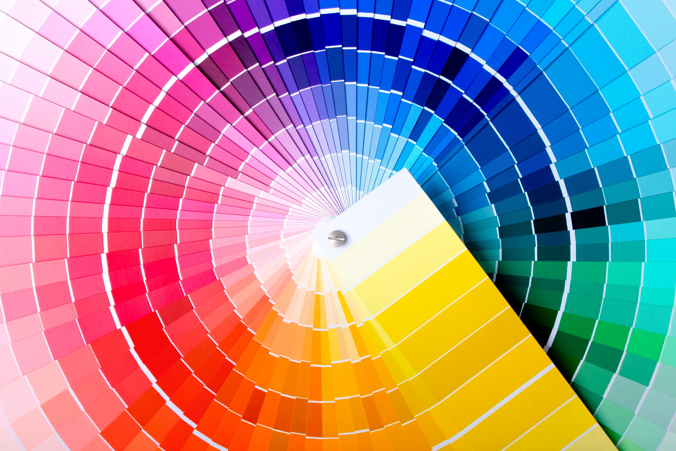
To get the results you want from your color choices, get more comfortable using the technical terms artists and designers use. A good place to start is with hue, saturation, and value. These three fundamental color factors are the basis for all the colors we see.
Hue: Hue is what we generally mean when we speak of color. Every hue humans can perceive falls along the continuum of colors—or combination of colors—in a rainbow.
You may have learned the mnemonic Roy G. BIV to remember the names of the rainbow’s colors. R is Red, then Orange, Yellow, Green, Blue, Indigo and Violet. The primary colors are red, yellow and blue. From these three all other colors can be derived.
Saturation: Saturation describes how closely a color appears to be true to the color cast by a prism. A saturated paint color has little or no other color mixed in. The higher the percentage of just one color a paint sample has, the more saturated the color.
Value: Value expresses the light and dark of color. When you mix paints with white, you get a lighter tint. Add black and you get a darker shade. Color value is closely related to luminosity, the relative differences between light and dark colors.
Light values are more luminous because they reflect more light. Dark values absorb more and reflect less light. When a lighter value is placed next to one that’s darker, the light one will appear more luminous and the dark one even darker. You can get a sense of a color’s value when you see it rendered in black and white photography. You might discover, for example, that a certain brown turns out to be a lighter gray (more luminous) than a medium blue.
Light and Color Temperatures
Different light conditions alter our perception of any hue, shade or tint. In outdoor environments, the daily progression of sun and clouds, shade and night means more light changes more frequently. Artificial lighting at night adds further complication, since not all lights have the same effect.
Consumers revolted when manufacturers changed home lighting away from warm tungsten lightbulbs to cooler but more energy efficient florescent and LED bulbs. Manufacturers took note of the resistance and developed LEDs closer to tungsten. Now you see displays in big box stores demonstrating the effects on color samples from all sorts of bulbs going from warm yellow to bright white.
We often speak of color temperature: we call bright reds hot—like fire—yellows and oranges are warm, greens cool and comforting. Too much blue and white can feel cold, like snow and ice. Bright white paint looks yellow in tungsten light, blue in florescent. The yellow bias of tungsten lighting makes red, yellow and orange pop, but green and blue look more muted. Cool white florescent or LED lights perk up blues and greens.
Study and Practice: The Art of Color
Artists and designers spend a lifetime studying color and learning even more through continuous practice. Today, a designer’s tool box includes both traditional methods and lessons learned from physics, chemistry, biology, and social psychology.
Clearly no one article can provide a complete guide to all design methods. You can find a lot more information online, including presentations on Vimeo and YouTube.
Another good place to start is with Hornung’s book. The third edition of “Color: A workshop for designers and artists” was released in August 2020. It’s beautifully illustrated, including a glossary with color examples for each term. Every chapter has a few practical exercises the author assigns students (hence the “workbook” title). You can do the exercises yourself, or just have a good read. You’ll likely find yourself going back to the book as a reference.
Making Color Choices
The art of good color design rests on an infinite number of variables and choices. But it doesn’t have to become overwhelming, or spoiled by wrong choices. Go ahead and choose the colors that please you, that reflect your lifestyle.
Collaborate with others to help get you past that color perception conundrum. Use the language of color to talk about how those choices contribute to what you want to achieve. For big jobs, look for professional guidance from someone who knows how to apply your colors to achieve the best effect.
As you become more conversant in the language of color, you may even find it easier to make color choices with your spouse. It worked for me.