Keep Your Balance: the First Principle of Good WaterSpace Design
Use balance to pull together all the elements in your outdoor living space
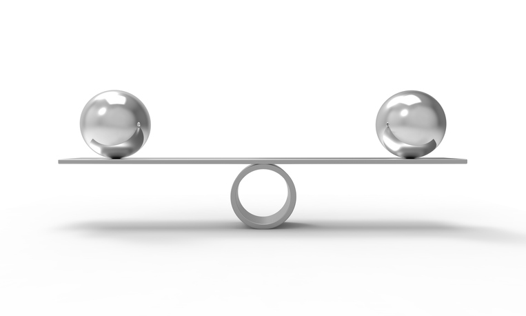
Just as we can’t stand erect without balance, humans can’t stand an environment lacking a sense of balance. Like our physical balance, we don’t consciously notice balance in built spaces. Until it’s missing. Then it may be too late.
Balance in 3-Dimensions
Artists and photographers work on a flat, two-dimensional plane and have an array of design techniques to achieve balance. However, architects, builders, and landscape architects work in three dimensions.
The third dimension provides fewer options for achieving balance and opens troublesome opportunities for overlooking imbalance in some area of the design. A design can look fine on paper, but when built and viewed from some angle, something may feel unbalanced.
Our best choices in three dimensional designs come down to symmetrical or asymmetrical balance. In any design, both symmetrical or asymmetrical balance rest on visual weight. Balance is largely achieved by shape, with some help along the way by texture and color.
We call it visual weight because physically heavy features (say, stone) on one side can look balanced to the eye by placing lighter objects on the other side—lattice or windows, for example—that visually match the stone’s mass. You can do the same with masses of plants, trees, open spaces or water features.
 Symmetrical Balance and Pleasing Style
Balanced designs are pleasing designs. Symmetry gives your space an orderly, structured, carefully planned feel. It starts with straight lines and neat circles, all lined up along a central axis. Each side of the center line is the mirror image of its counterpart.
Symmetrical, balanced designs appeal to our senses. They feel comfortable, predictable, safe, when done with restraint and on a human scale. You can see this in classic public buildings in Philadelphia. Think red brick and Independence Hall, or its smaller and less famous neighbor, Carpenter’s Hall.
On a grander scale, balanced, symmetrical design declares order, grandeur, and authority. Think marble and the larger, more imposing buildings in Washington, D.C., or just about any capital city. You can find the same large-scale symmetrical balance in India’s Taj Mahal, and many of the most picturesque museums, art galleries, university campuses, parks, and estates.
 Asymmetrical Balance and Interesting Style
Asymmetrical balance brings out the artist, the interesting detail, a focal point, a place that holds your eye, that moves you forward. It can be fun, even daring.
It still supplies the balance we need to feel, but it brings out more opportunities for individual style to express itself.
You find asymmetrical balance in nature. Natural can feel more casual, calm and relaxing—like a quiet pond—or wilder, looser—like a rushing river or incoming tide.
You Can Blend Symmetrical and Asymmetrical
Skilled designers will blend symmetrical and asymmetrical balance, giving you the best of both. You can create a pool area that is modern, formal. There’s no mistaking its symmetrical balance. The straight lines and rectangular shapes with sleek, smooth surfaces feel cool, contemporary, sophisticated.
The adjoining garden can be made up of curved lines, irregular shapes. Its asymmetrical balance is in harmony with its neighboring pool area, and at the same time it provides a welcome contrast. You can feel the garden’s warmth in the designer’s rendering. You can imagine the visual interest and seasonal changes nature brings to the setting.
Sometimes it’s OK to Get a Little Off-Balance
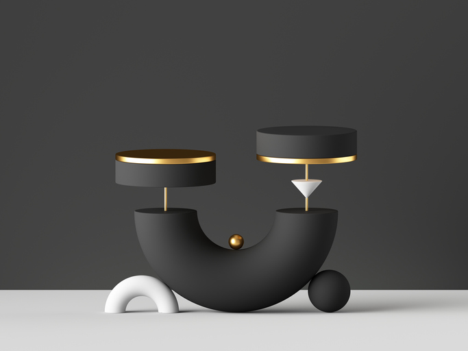
There are times when a clever designer—and brave clients—may choose to get a bit off-balance in their design. Off-balance designs can become an interesting point of attention, or an unwelcome distraction. Even a little off-balance can look like a mistake (and probably is)—unless it’s done purposefully and with great skill.
I wouldn’t recommend no-balance designs. This creates visual chaos. Without clear purpose—and some visual relief—chaos is disturbing to the eye and unsettling to the body.
A Question of Style: Fashion Trend or Fad?
In my Introduction to our series on design principles, I touched on how the style you choose will point you toward the balance you’ll need.
We’re all influenced by trends in style. Inevitably, some disappoint and turn out to be fads. When styles in architecture are trends, they last for years, decades, centuries. When a new style is a fad—suddenly fashionable overnight—it can become unfashionable even faster.
The good news is that today’s big outdoor living trend is Modern—or Modern Contemporary. The trend started on the West Coast and has moved east. The Modern Contemporary style is a fresh take on 20th Century Modern. Modern style’s roots go way back, to Classic Greek architecture and the Greek Revival styles that arrived in America in the 19th Century.
When you think about style, take a wide view to start. You don’t want to limit your initial thinking to the one thing that appears fashionable now, or the one thing that’s been your default forever. Get to know various architectural and landscape styles, learn as much as you can about design elements and principles. Allow yourself the time to find the style that pleases you, that fits your needs and feels right for you.
Then get the best design help you can find. Whatever the style, good design is timeless.


